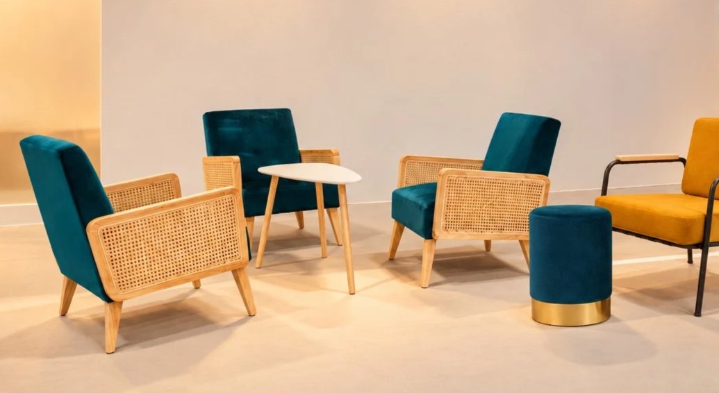
Event Furniture Color Trends for 2027
Natural and Mineral Tones
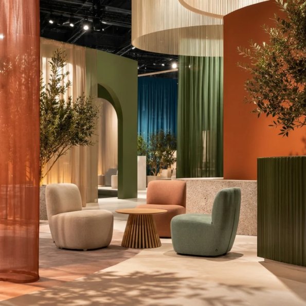
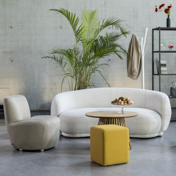
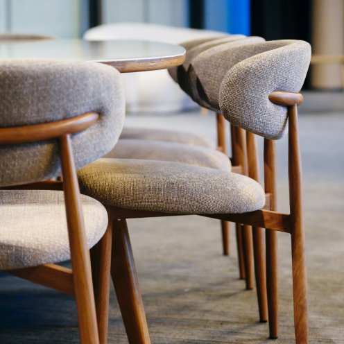
Nature-inspired colors are expected to remain popular in event spaces in 2027. Beige, linen white, terracotta, stone gray, and sage green create spaces that feel sophisticated, understated, and welcoming.
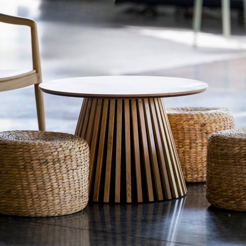
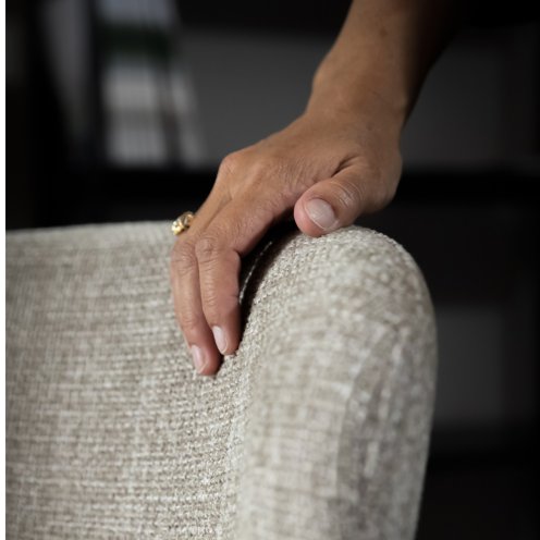
These shades work particularly well when paired with natural materials. For example, a beige upholstered chair paired with a small wooden side table can create a very different look from an all-white furniture arrangement.
Alongside natural tones, bolder trends are also expected to gain traction in 2027, including sleek, design-forward chrome silver and floral-inspired prints, which bring depth, a touch of whimsy, and character to event designs.
Another advantage of this palette is its versatility. It works just as well with minimalist event design as it does with more elaborate settings, adapting to different brand identities and venue styles.
These colors also provide an interesting foundation for exhibition booth design. They make it easy to introduce a few more colorful accents without overwhelming the overall look.
Rich Pastels and Soft, Muted Shades
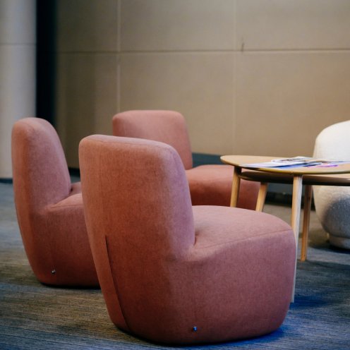
Soft, muted colors are evolving, too. Rather than relying solely on very pale pastels, event designers can experiment with slightly richer shades, such as dusty rose, blue-gray, sage green, and pale yellow.
The goal isn't necessarily to use lots of different colors. A few well-placed accents can add depth to a space and create a distinctive atmosphere.
Paired with light wood, textiles, or matte finishes, these shades bring a softer feel to event furniture. They work particularly well in a lounge, VIP area, or reception space where the goal is to create a comfortable atmosphere without overwhelming the setting with too much decor.
Signature Colors to Define an Exhibition Booth or Trade Show Space
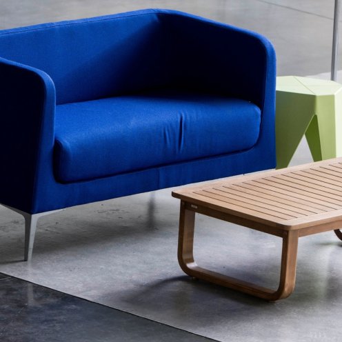
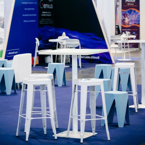
Alongside natural color palettes, bold colors remain effective when used intentionally. A signature color can make a booth instantly recognizable on a busy trade show floor.
The idea isn't to make everything colorful. A single armchair, bar, a few seats, or a storage unit can be enough to create contrast and draw attention.
The right choice depends on the brand identity, as well as the event theme, season, and surrounding environment. For example, a color used prominently on an exhibition booth might be introduced much more subtly in an institutional setting.
This targeted approach helps strengthen brand visibility while maintaining a balanced event design.
Coordinating Furniture, Flooring, Partitions, and Signage
Furniture rarely makes the biggest impact on its own. To create a cohesive look, it's important to consider all the elements that make up the space together: furniture, flooring, partitions, wall finishes, lighting, and signage.
This is particularly important for an exhibition booth or brand space. Even a striking piece of furniture can lose its impact if the surrounding environment doesn't reflect the same visual language.
At GL events Mobilier, this approach can be part of a broader event space design strategy, bringing furniture selection together with other elements of the overall setting. The goal is to create a cohesive environment in which colors, materials, and signage complement one another rather than compete for attention.
This approach helps deliver cohesive event spaces, from the furniture itself to the elements that define and structure the environment.